.swcp-self-contained .swcp-design-root{
--cream: #f6efe4;
--cream-deep: #ede3d2;
--terracotta: #b5572f;
--terracotta-soft: #c97a55;
--sage: #8a9a7b;
--sage-deep: #5f6e54;
--wood: #3d2b1f;
--ink: #2a1f17;
--muted: #6b5d51;
font-family: 'Inter', system-ui, -apple-system, sans-serif;
color: var(--ink);
background: var(--cream);
line-height: 1.65;
font-size: 17px;
}.swcp-self-contained .swcp-design-root *.swcp-design-root *::before.swcp-design-root *::after{ box-sizing: border-box; }.swcp-self-contained .swcp-design-root h2.swcp-design-root h3{
font-family: 'Lora', Georgia, serif;
font-weight: 500;
color: var(--wood);
letter-spacing: -0.01em;
}.swcp-self-contained .swcp-design-root .eyebrow{
font-family: 'Inter', sans-serif;
font-size: 0.72rem;
font-weight: 600;
letter-spacing: 0.22em;
text-transform: uppercase;
color: var(--terracotta);
margin-bottom: 1.25rem;
display: block;
}.swcp-self-contained .swcp-design-root .hero{
padding: clamp(3rem, 7vw, 6rem) clamp(1.25rem, 4vw, 3rem) clamp(3rem, 6vw, 5rem);
max-width: 1200px;
margin: 0 auto;
display: grid;
gap: clamp(2rem, 5vw, 4rem);
grid-template-columns: 1fr;
align-items: center;
}@media (min-width: 860px){.swcp-self-contained .swcp-design-root .hero{ grid-template-columns: 1.05fr 1fr; }
}.swcp-self-contained .swcp-design-root .hero-text .studio-mark{
font-family: 'Lora', serif;
font-style: italic;
font-size: 1rem;
color: var(--sage-deep);
margin-bottom: 1.5rem;
letter-spacing: 0.05em;
}.swcp-self-contained .swcp-design-root .hero-text h2{
font-size: clamp(2.4rem, 5.8vw, 4.2rem);
line-height: 1.05;
margin: 0 0 1.5rem;
font-weight: 400;
}.swcp-self-contained .swcp-design-root .hero-text h2 em{
font-style: italic;
color: var(--terracotta);
}.swcp-self-contained .swcp-design-root .hero-promise{
font-family: 'Lora', serif;
font-style: italic;
font-size: clamp(1.15rem, 2vw, 1.4rem);
color: var(--muted);
margin: 0 0 2.5rem;
max-width: 26rem;
line-height: 1.5;
}.swcp-self-contained .swcp-design-root .btn{
display: inline-block;
background: var(--wood);
color: var(--cream);
padding: 1.05rem 2.2rem;
font-size: 0.92rem;
font-weight: 500;
letter-spacing: 0.12em;
text-transform: uppercase;
text-decoration: none;
border-radius: 999px;
transition: background 0.3s ease, transform 0.3s ease;
}.swcp-self-contained .swcp-design-root .btn:hover.swcp-design-root .btn:focus{
background: var(--terracotta);
transform: translateY(-1px);
}.swcp-self-contained .swcp-design-root .hero-figure{
position: relative;
margin: 0;
}.swcp-self-contained .swcp-design-root .hero-figure img{
width: 100%;
height: auto;
display: block;
border-radius: 4px;
aspect-ratio: 4 / 5;
object-fit: cover;
box-shadow: 0 30px 60px -30px rgba(61,43,31,0.35);
}.swcp-self-contained .swcp-design-root .hero-figure::after{
content: "";
position: absolute;
inset: auto -1.5rem -1.5rem auto;
width: 60%;
height: 60%;
background: var(--sage);
opacity: 0.18;
border-radius: 4px;
z-index: -1;
}.swcp-self-contained .swcp-design-root .philosophy{
background: var(--cream-deep);
padding: clamp(4rem, 9vw, 7rem) clamp(1.25rem, 4vw, 3rem);
}.swcp-self-contained .swcp-design-root .philosophy-inner{
max-width: 780px;
margin: 0 auto;
text-align: center;
}.swcp-self-contained .swcp-design-root .philosophy h2{
font-size: clamp(1.8rem, 3.5vw, 2.6rem);
margin: 0 0 2rem;
font-style: italic;
font-weight: 400;
}.swcp-self-contained .swcp-design-root .philosophy p{
font-size: clamp(1.05rem, 1.7vw, 1.2rem);
line-height: 1.8;
color: var(--ink);
margin: 0;
}.swcp-self-contained .swcp-design-root .classes{
padding: clamp(4rem, 9vw, 7rem) clamp(1.25rem, 4vw, 3rem);
max-width: 1200px;
margin: 0 auto;
}.swcp-self-contained .swcp-design-root .classes-head{
max-width: 640px;
margin: 0 auto clamp(3rem, 5vw, 4rem);
text-align: center;
}.swcp-self-contained .swcp-design-root .classes-head h2{
font-size: clamp(2rem, 4vw, 2.8rem);
margin: 0;
font-weight: 400;
}.swcp-self-contained .swcp-design-root .class-grid{
display: grid;
gap: clamp(1.5rem, 3vw, 2.5rem);
grid-template-columns: 1fr;
}@media (min-width: 720px){.swcp-self-contained .swcp-design-root .class-grid{ grid-template-columns: repeat(3, 1fr); }
}.swcp-self-contained .swcp-design-root .class-card{
background: var(--cream);
padding: 2.5rem 2rem;
border-top: 2px solid var(--terracotta);
display: flex;
flex-direction: column;
gap: 1rem;
transition: transform 0.4s ease;
}.swcp-self-contained .swcp-design-root .class-card:hover{ transform: translateY(-4px); }.swcp-self-contained .swcp-design-root .class-card .num{
font-family: 'Lora', serif;
font-style: italic;
font-size: 1rem;
color: var(--sage-deep);
}.swcp-self-contained .swcp-design-root .class-card h3{
font-size: 1.45rem;
margin: 0;
font-weight: 500;
}.swcp-self-contained .swcp-design-root .class-card p{
margin: 0;
color: var(--muted);
line-height: 1.7;
}.swcp-self-contained .swcp-design-root .teacher{
background: var(--wood);
color: var(--cream);
padding: clamp(4rem, 9vw, 7rem) clamp(1.25rem, 4vw, 3rem);
}.swcp-self-contained .swcp-design-root .teacher-inner{
max-width: 1100px;
margin: 0 auto;
display: grid;
gap: clamp(2rem, 5vw, 4rem);
grid-template-columns: 1fr;
align-items: center;
}@media (min-width: 820px){.swcp-self-contained .swcp-design-root .teacher-inner{ grid-template-columns: 1fr 1.2fr; }
}.swcp-self-contained .swcp-design-root .teacher figure{ margin: 0; }.swcp-self-contained .swcp-design-root .teacher img{
width: 100%;
height: auto;
display: block;
aspect-ratio: 4 / 5;
object-fit: cover;
border-radius: 4px;
}.swcp-self-contained .swcp-design-root .teacher .eyebrow{ color: var(--terracotta-soft); }.swcp-self-contained .swcp-design-root .teacher h2{
color: var(--cream);
font-size: clamp(2rem, 4vw, 2.8rem);
font-weight: 400;
margin: 0 0 1.5rem;
}.swcp-self-contained .swcp-design-root .teacher h2 em{ font-style: italic; color: var(--terracotta-soft); }.swcp-self-contained .swcp-design-root .teacher p{
color: #ddd0bd;
font-size: 1.05rem;
line-height: 1.8;
margin: 0;
max-width: 32rem;
}.swcp-self-contained .swcp-design-root .voices{
padding: clamp(4rem, 9vw, 7rem) clamp(1.25rem, 4vw, 3rem);
max-width: 1100px;
margin: 0 auto;
}.swcp-self-contained .swcp-design-root .voices-head{ text-align: center; margin-bottom: clamp(3rem, 5vw, 4rem); }.swcp-self-contained .swcp-design-root .voices-head h2{
font-size: clamp(1.8rem, 3.5vw, 2.4rem);
font-weight: 400;
font-style: italic;
margin: 0;
}.swcp-self-contained .swcp-design-root .voice-grid{
display: grid;
gap: clamp(1.5rem, 4vw, 3rem);
grid-template-columns: 1fr;
}@media (min-width: 720px){.swcp-self-contained .swcp-design-root .voice-grid{ grid-template-columns: 1fr 1fr; }
}.swcp-self-contained .swcp-design-root .voice{
padding: 0 1rem;
border-left: 1px solid var(--cream-deep);
padding-left: 2rem;
}.swcp-self-contained .swcp-design-root .voice blockquote{
margin: 0 0 1.25rem;
font-family: 'Lora', serif;
font-style: italic;
font-size: clamp(1.15rem, 1.8vw, 1.35rem);
line-height: 1.6;
color: var(--wood);
}.swcp-self-contained .swcp-design-root .voice cite{
font-style: normal;
font-size: 0.8rem;
letter-spacing: 0.18em;
text-transform: uppercase;
color: var(--sage-deep);
font-weight: 600;
}.swcp-self-contained .swcp-design-root .closing{
background: var(--sage);
color: var(--cream);
padding: clamp(4rem, 9vw, 7rem) clamp(1.25rem, 4vw, 3rem);
text-align: center;
}.swcp-self-contained .swcp-design-root .closing h2{
color: var(--cream);
font-size: clamp(2.2rem, 5vw, 3.6rem);
font-weight: 400;
font-style: italic;
margin: 0 0 1rem;
letter-spacing: -0.01em;
}.swcp-self-contained .swcp-design-root .closing p{
font-size: 1.15rem;
margin: 0 0 2.5rem;
color: #f1ead9;
letter-spacing: 0.02em;
}.swcp-self-contained .swcp-design-root .closing .btn{
background: var(--cream);
color: var(--wood);
}.swcp-self-contained .swcp-design-root .closing .btn:hover{ background: var(--terracotta); color: var(--cream); }
, Stillpoint, Utrecht
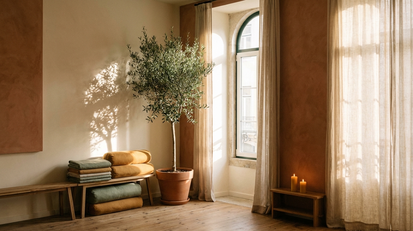
A place to slow a down , breathe in, and land.
Studio name is Stillpoint. A quiet room, a long exhale, an hour that belongs to you.
Book a class
Why Yin
The deep work of staying still.
Yin yoga works with long holds, two, three, five minutes in a single shape. Not to push further, but to let go. The deep connective tissues soften, the breath settles, and the nervous system remembers how to rest. It is quiet work. It stays with you.
The Practice
Three ways into the stillness.
01
Restorative Yin
Supported shapes, bolsters and blankets, complete ease. For when the body needs permission to stop.
02
Yin & Sound
Long holds layered with live singing bowls and gentle drone. The sound does something the silence cannot.
03
Beginner's Yin
No experience needed, no flexibility required. Just show up as you are.
“
I emailed in a small panic on a Sunday. By Wednesday the new site was live and people were finding the right page on the first try. I am a baker. I should not have to think this hard about technology. MBMarije van Beek
Bakker Marije · Utrecht
Your Teacher
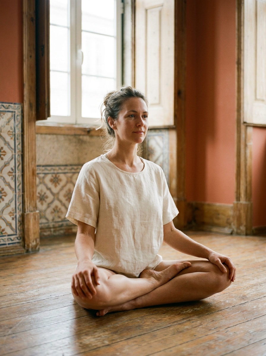
Meet Sofia .
Her name is Sofia. She found yin during a period of burnout and has been teaching it ever since. She trained in Lisbon and Kyoto, holds certifications in yin yoga and restorative practice, and teaches in a way that is direct and unhurried. She believes the mat should feel like a pause, not a performance.
In Their Words
What students say.
"I came for the flexibility. I stayed because it is the one hour a week where I genuinely stop."
Marta R.
"I was sceptical, I am a runner, I like to move. Two classes in and I slept better than I had in months."
João A.